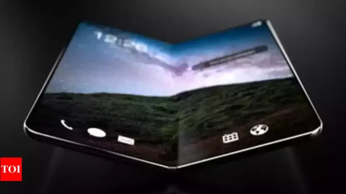
Foldable displays are cutting-edge technology that has the potential to revolutionize the way we use mobile devices by maximizing screen real estate in unprecedented ways. Here are a few ways foldable screens can help you maximize your screen real estate using foldable devices:
Larger Displays for Greater Productivity: Foldable screens provide larger displays, which can dramatically boost productivity. A larger screen allows you to see more stuff at once, making it easier to work on papers, edit images, or view numerous programs simultaneously. This can result in better multitasking and efficiency since you can see and interact with more stuff without continually navigating between apps or windows.

Seamless convert from Phone to Tablet: With a simple fold or unfold motion, foldable devices may seamlessly convert from a phone-sized screen to a tablet-sized screen. This means you can have the convenience of a smaller device for everyday tasks like making calls or sending messages, and then unfold it into a larger tablet-sized screen when you need more screen real estate for tasks like reading documents, watching videos, or playing games.
Creative Form Factors for Unique Use Cases: Foldable displays open the door to creative form factors that can cater to specific use cases. A foldable device, for example, can be used in “book” mode, in which the screen is folded in half like a book, providing a dual-screen experience for reading e-books, watching news articles, or browsing social media. This one-of-a-kind form factor optimizes screen real estate for specific use scenarios, resulting in a more immersive and intuitive user experience.
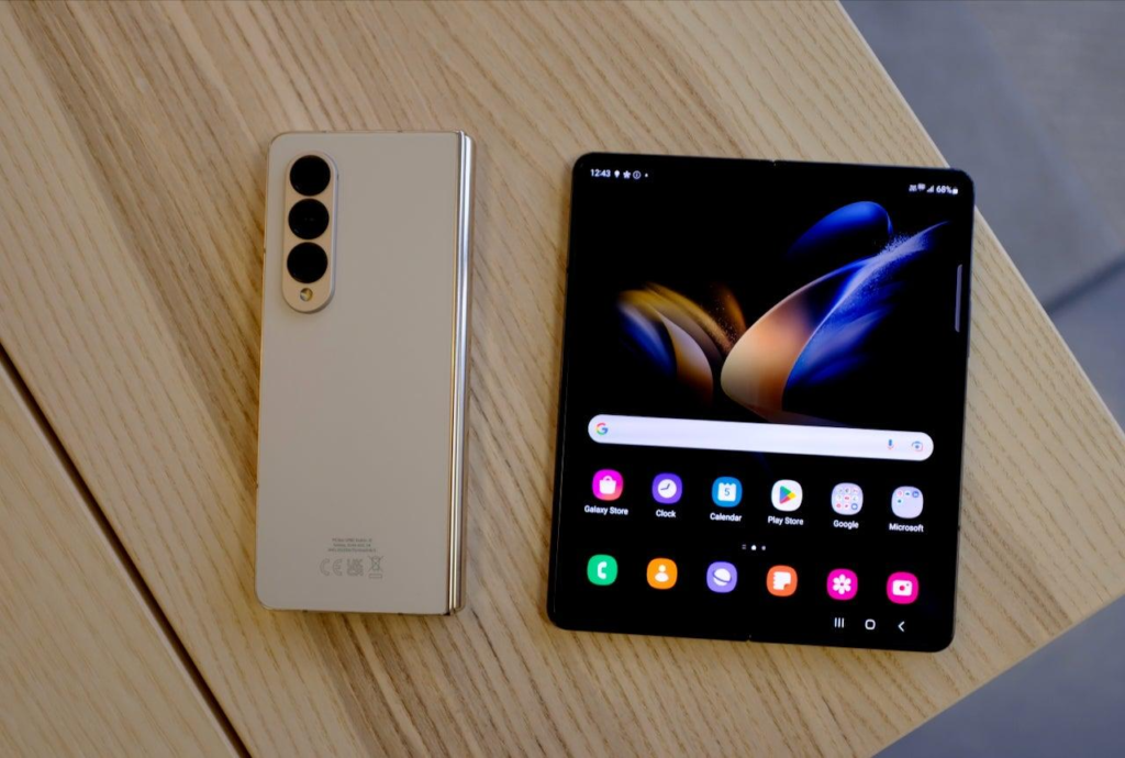
Enhanced Content Consumption and Media Viewing: Foldable screens can improve content consumption. You may enjoy a more immersive and dramatic watching experience for videos, movies, and other multimedia content with a larger unfurled display. The larger screen real estate can also improve gaming enjoyment by giving a more immersive and engaging experience. Furthermore, foldable smartphones can support split-screen or multi-window viewing, which allows you to watch a film or play a game on one portion of the screen while browsing the web or talking with friends on the other.
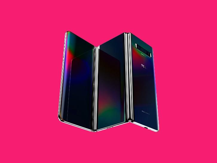
Flexibility for Various Modes and Use Cases: Foldable screens offer versatility in terms of various modes and use cases. For example, a foldable device can be used in laptop mode, where the screen is partially folded to create a virtual keyboard for typing, simulating a laptop-like experience. This can help with productivity chores like writing emails or working on projects. Foldable displays may also be utilized in tent mode, which allows you to prop up the device and use it hands-free for video chats, presentations, or watching videos. This adaptability allows users to tailor the gadget to their unique requirements, maximizing screen real estate for various use cases.
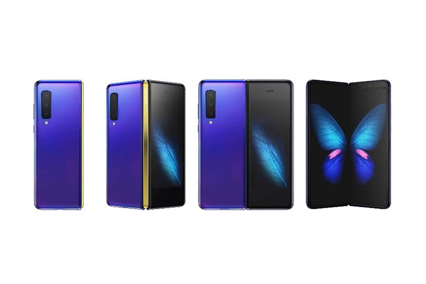
Finally, foldable screens open up the intriguing potential for increasing screen real estate in mobile devices. Foldable devices, with larger displays, seamless phone-to-tablet transitions, innovative form factors, enhanced content consumption, and flexibility for different modes and use cases, have the potential to revolutionize the way we interact with screens and provide new levels of productivity, convenience, and entertainment. As technology advances, we should expect to see even more imaginative implementations of foldable screens in the future, unlocking even more potential for maximizing screen real estate.
Table of Contents
Design that is responsive or adaptable
Responsive design is the first step toward supporting foldable devices. Responsive layouts allow an app to look and function well on a wide range of display sizes, including the folded and unfolded screens of a foldable smartphone.
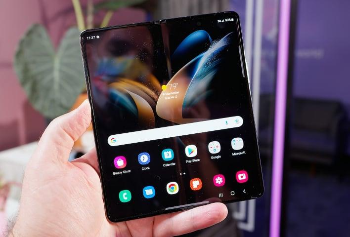
However, the layout must sometimes be modified. The changes in screen size and aspect ratio between folded and unfolded screens might be so great that even a responsive layout cannot handle both displays properly. Adaptive design generates alternate layouts that are optimized for various screen sizes and setups. When a foldable device is folded or unfolded, in portrait or landscape orientation, or tabletop or book posture, adaptive layouts optimize the user experience.
A large-screen foldable device, for example, unfurled in landscape position is similar to a tablet; a two-pane structure with a navigation rail makes excellent use of the enormous screen. When folded, the gadget resembles a regular phone; a single-column layout with a bottom navigation bar is straightforward but effective. Because the layouts are distinct, you can tailor each to a specific use case.
Adaptive design optimized for both folded and unfolded screens.
Foldable devices can fold inward, with the display folding into the device’s interior, or outward, with the display wrapping around the device. Responsive/adaptive design positions your app to accommodate a wide range of foldable form factors.
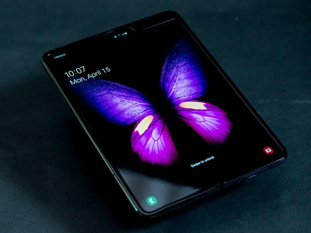
States and postures that can be folded
A foldable device’s fold separates the screen into two sections. On dual-screen devices, the fold might be a flexible section of the screen or a hinge that separates the two displays.
The fold has a dimension and an IIusion Type attribute that specifies if it obscures any area of the display. On dual-screen smartphones, the occlusion type is FULL, which means that no content is shown in the fold (hinge) area, even if an app spans both displays.

Leave a Reply